

Thank goodness for an amazing weekend of football to take our minds off the political landscape. Case Keenum is a stable genius. Big Ben got whacked by that nasty Stormy Daniels that moved up the coast from Jacksonville. Philadelphia fended off a looming shutdown by focusing on defensive spending.
And everyone agrees the Patriots don’t collude. It’s been proven. Everyone knows that. No collusion. Everyone agrees to that.
I can hear Bawston fans already, “JP – you’re a Patriotist!”
I am not a Patriotist! I am the least Patriotist person you know! Believe me. I love Patriots. LOVE Patriots!
I just don’t want them moving here taking our jobs. Why can’t more fans from LA move here? They’re beautiful and non-threatening, right? Why can’t we take more of them?
LA fans – “Ummmm, we’re not moving from here to that sh*hole!”
Thank goodness for the football distractions this week to keep our minds off sh*thole politics.
Last Week This Morning
- 10T ran up to 2.59% on news that China may reduce purchases of Treasurys and the BoJ may slow the pace of accommodation
- 2T broke 2.00% for the first time since 2008 (bad for caps)
- German Bund up to 0.58%
- Other than a few days in July, this is the highest yield in two years
- Core CPI came in at 1.8% vs forecasted 1.7%
- Conflicting signals from Fed speakers about the number of hikes this year, but more raised concerns about hiking too fast
Treasury Yields
From Ernest Hemingway’s 1926 novel, The Sun Also Rises:
“How did you go bankrupt?” Bill asked.
“Two ways,” Mike said. “Gradually and then suddenly.”
Removal of accommodation by central banks. Sustained US growth aided by tax cuts. Improving global economies.
There is an undeniable upward pressure on yields that we haven’t experienced in some time. And with 10 year Treasury volatility at all-time lows, it feels like a painful adjustment could be on the horizon.
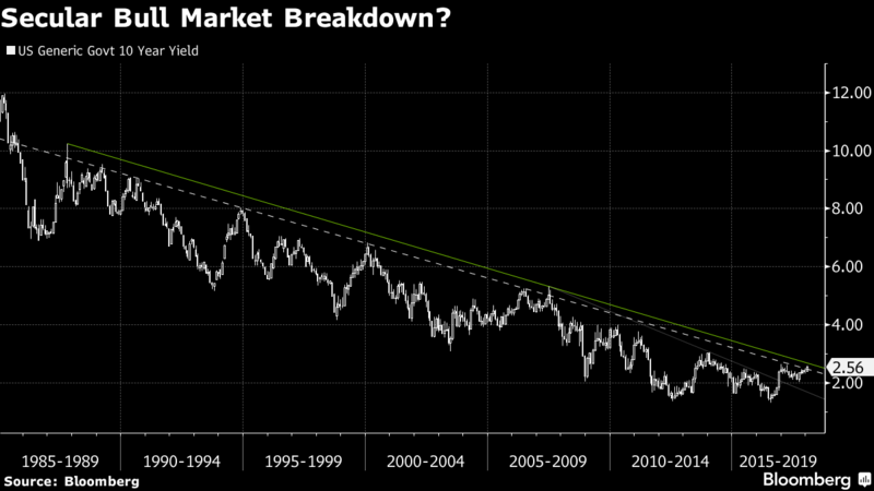
Bloomberg interest rate and derivative strategist Tanvir Sandhu wrote an interesting article last week about 10yr yields (https://www.bloomberg.com/news/articles/2018-01-11/what-bond-rout-let-s-not-get-carried-away-by-the-hype-and-noise).
He noted that the 40-ish year bond bull market was likely coming to an end. The 10T has generally moved lower by about 20bps per year since the days of Volcker. Unless we are ready to see negative interest rates, that can’t continue forever.
But he also noted that the recent fear mongering is overdone. “The short-dated volatility skew between payer and receiver options on 10-year dollar swap rates is flat, indicating limited expectations for significant moves in long-dated yields. A steeper skew would indicate payers gaining relative to receivers, signaling expectations for higher rates. Short-dated skews tend to predict changes in underlying rates.”
Take a look below at the graph he presented. Without diving into a lengthy explanation on derivative options, the takeaway is that markets aren’t pricing in the sort of higher yields that most pundits are calling for. As a point of comparison, the spike in the middle of the graph is post-election. We are not anywhere close to that type of market sentiment today.
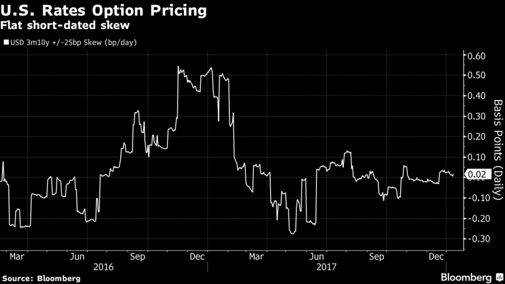
But markets can be wrong, just like they (and we) were wrong pre-election.
And like the post-election movement, Treasury yields don’t always move in a nice, orderly fashion.
Sometimes they move gradually, then suddenly.
We continue to believe there are far greater risks to higher Treasury yields than anytime since the Great Recession. For long time readers of this newsletter, this marks a dramatic shift from our long-term belief of low rates. While we haven’t switched sides yet, we view the risks as much greater than in previous years.
Exhibit A – Inflation Expectations
Market expectations for inflation are moving higher, even if actual inflation prints haven’t materialized. Outside of a brief time post-election, inflation expectations are the highest since 2014.
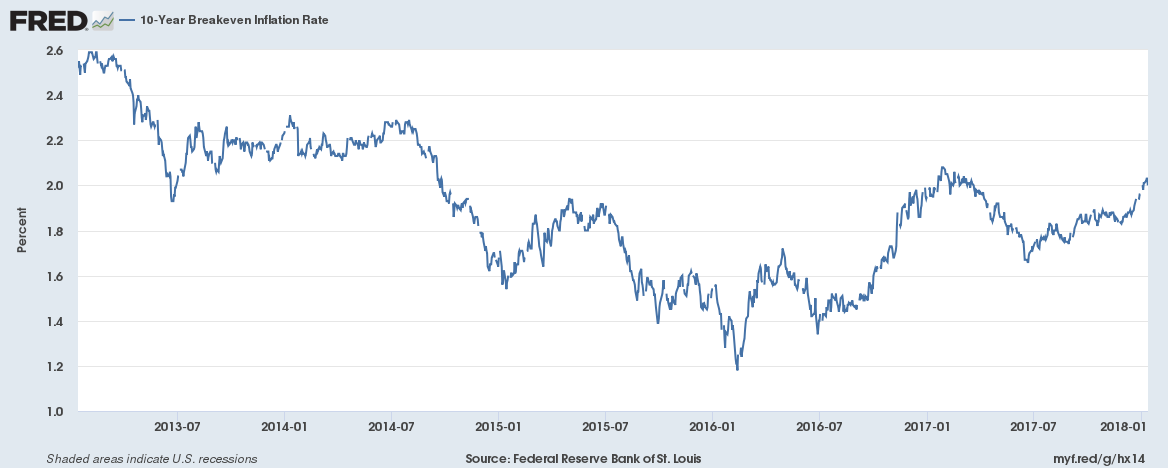
Exhibit B – ECB and BoJ Accommodation Removal
The BoJ caught markets offguard with a “stealthy taper” on Tuesday, slowing the pace of monthly bond purchases under its own QE program.
The ECB’s minutes were released Thursday and were more hawkish than expected, raising the potential for a faster-than-expected exit from QE.
- The euro spiked to a three year high against the dollar
Just because we don’t have a graph for this Exhibit doesn’t make it less important. We have been stressing the global removal of accommodation for nearly a year now as perhaps the biggest theme for the next several years. Until now, central bank removal of accommodation has largely been restricted to the US as our economy has recovered faster than our peers.
But it is clear that other economies are starting to recover and it is the combined removal of accommodation that could shift US yields. Throw in the Fed’s own balance sheet reduction program and the anticipated $400B+ in additional supply and the stage is set for higher yields.
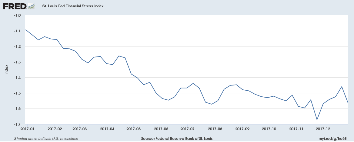
Exhibit C – Financial Conditions Stress Indices
Although the Fed is gradually increasing interest rates, financial conditions remain relatively loose. This encourages lending and risk taking. Let’s get graph-happy to make up for the lack of graphs in the previous section.
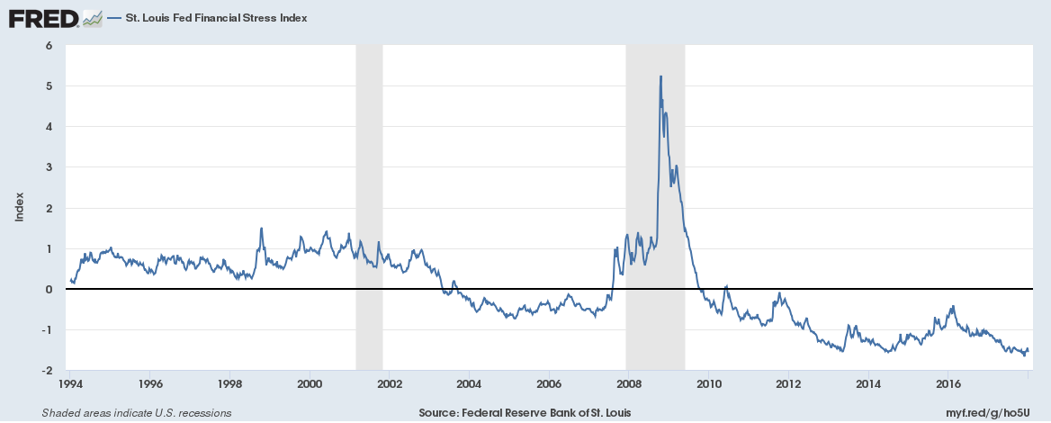
St Louis Fed Financial Stress Index (1 year)
The St Louis Fed has the coolest graphs around. Here’s its measure of Financial Stress over the last year. A 0 reading suggests financial conditions are neutral, neither tight nor loose.
It’s a little tough to read, but this index has drifted lower from -1.1 to -1.6. In other words, financial conditions were relatively loose and getting looser.
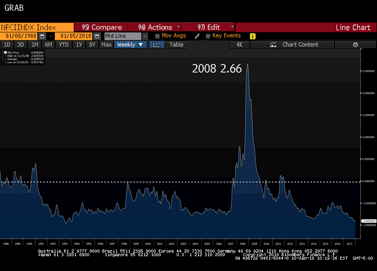
St Louis Fed Financial Stress Index (25 year)
Here’s the same graph, but over 25 years. It certainly appears that financial conditions are pretty accommodative despite the Fed hiking interest rates.
Chicago Fed National Financial Conditions Index – 5 Years
The Chicago Fed has a similar graph. While not nearly as user friendly, it suggest the same.
Source: Bloomberg Finance, LP
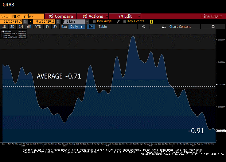
Chicago Fed National Financial Conditions Index – 30 Year History
Same graph over 30 years. The Great Recession caused this index to spike to 2.66, while today it is -0.91.
Source: Bloomberg Finance, LP
At a minimum, this should at least translate into continued potential for economic growth. More likely, it should help encourage growth.
Exhibit D – Fed Policy
While we assume Jay Powell will be the continuity candidate, we don’t know for sure. Couple this with a voting rotation that will leave the Fed more hawkish than last year and several remaining vacancies that could dramatically shift sentiment further depending on who Trump nominates, and this is one of the biggest wildcards in 2018.
- NY Fed President Dudley – tax cuts could lead to overheating, case for gradual tightening remains strong
- voting member in 2018, but retiring mid-year
- Dallas Fed President Kaplan – base case is for three hikes in 2018
- not a voting member this year
- St Louis Fed President Bullard – would take a decade of 2.5% inflation to make up for recent softness, should consider price targeting (allow inflation to overshoot)
- not a voting member this year
- Chicago Fed President Evans – economy growing stronger, expects 2.5% GDP this year. Tax cuts will boost investment. Inflation is only challenge policy makers face.
- not a voting member this year
- Minneapolis Fed President Kashkari – inflation too low globally, believes recent inflationary softness is structural, not transitory. Will likely continue to dissent.
- not a voting member this year
- Fed minutes showed three districts (Chicago, Minneapolis, and St Louis) opposed a hike in December.
One key takeaway from all that Fed-speak? None of them are voting members this year except Dudley, who already announced his retirement effective mid-2018.
Larry Summers noted last week that the Fed typically cuts rates about 5.00% during a recession. With FF at 1.50%, that isn’t possible this time around. The Fed is hiking to restock the ammo box for the next recession, but if it hikes too aggressively it could be part of the problem instead of the solution.
This creates an interesting dynamic – keep hiking to make room for the next downturn? Or hold off and allow inflation to run up?
Pensford speculation – we think Powell will hike gradually and believe two hikes in 2018 is far more likely than four hikes. If he overhikes, it could cause 10yr rates to fall as the market fears a recession. His dovish approach to Fed Funds will encourage risk taking and apply upward pressure on the long end of the curve.
Also, we expect more Fed-speak about price targeting. This is essentially inflation targeting but tries to compensate for misses. With inflation so low for so long, this would imply lower floating rates for longer, even if inflation approaches 2.0%. The Fed may actually let inflation run up to 2.5% before intervening. But as Bernanke noted last week, “Somewhere in 2019 there will be some pretty serious discussions” around price-targeting.
In a more extreme scenario, the Fed could gradually shift to GDP-targeting and abandon inflation targeting altogether.
Exhibit E – Net Shorts
Net shorts on 10yr rates peaked post-election, driving the T10 to 2.62%. Today, the net short position is much smaller than a year ago, yet with comparable yields. A dramatic increase in short positions could push the T10 through the key 2.62%-ish resistance level.
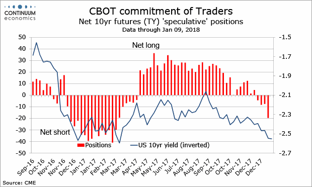
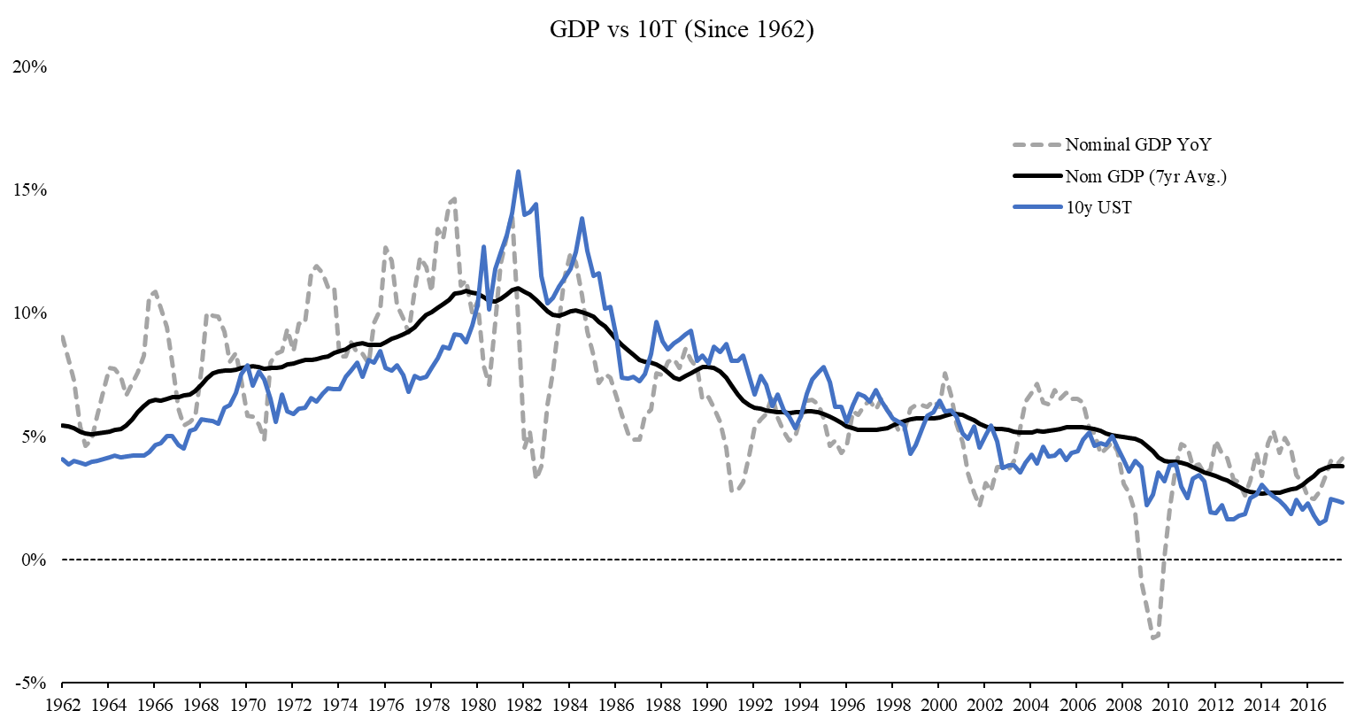
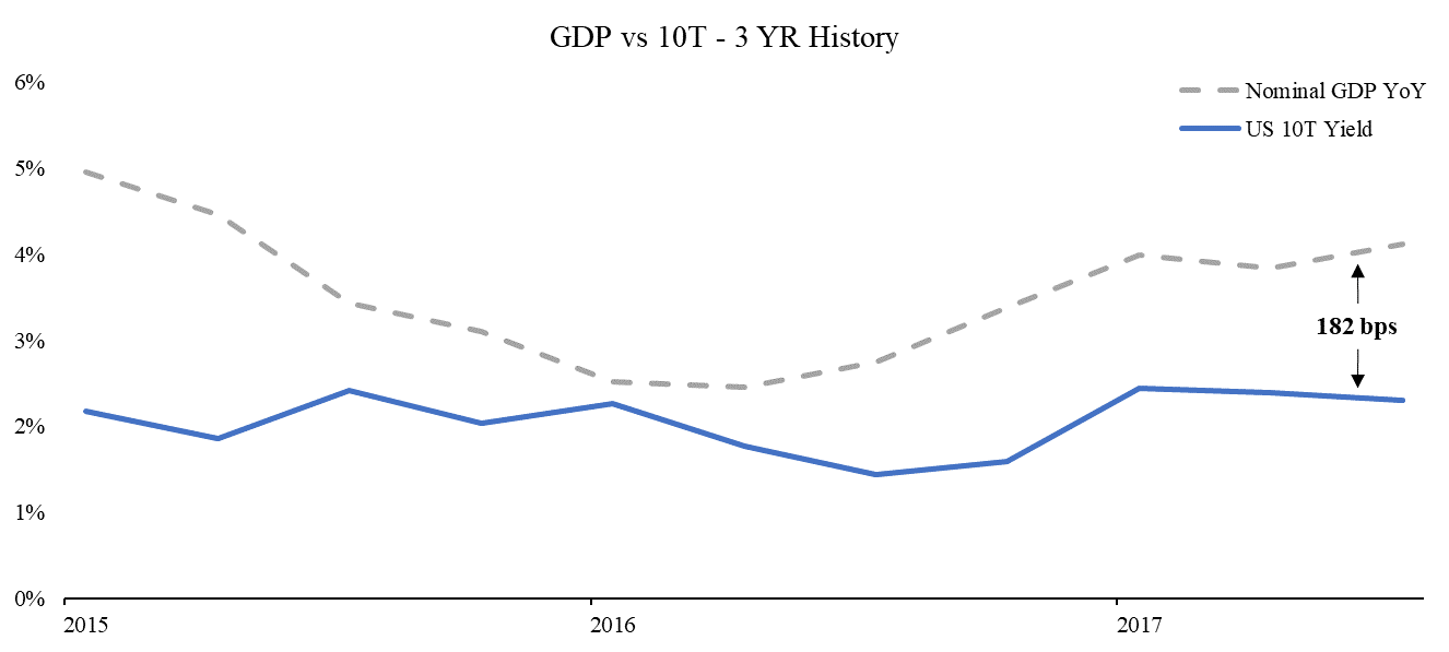
Exhibit F – Relationship Between GDP and 10yr Treasury
Here’s a graph illustrating the correlation between nominal GDP and the 10 year Treasury. Given the long timeframe, we also overlaid a seven year moving average to help smooth out the violent swings in GDP, but as you can see there is very clearly a strong correlation.
You’ll also notice that sometimes nominal GDP is higher, while other times the 10T is higher, but they generally seek each other out.
In the most simplistic of terms, the 10yr Treasury generally reflects market expectations for growth in the economy (real GDP).
Nominal GDP is essentially growth plus inflation expectations.
Since 1962, the average spread between these two has been 0.31% (ie, GDP is slightly higher).
Today, nominal GDP is about 1.82% higher than the 10T.
This could suggest that the 10T should push higher if GDP stays at or above current levels.
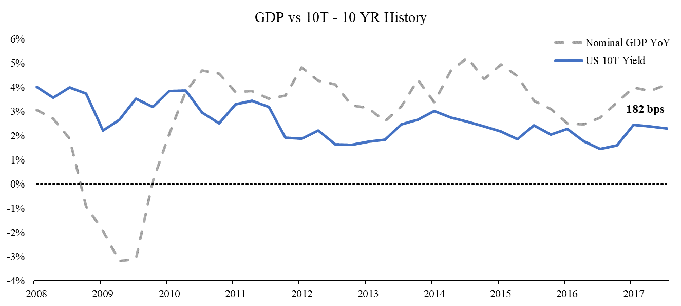
Now let’s zoom in a bit. Here’s the same graph over the last ten years. Given the shorter term horizon, we dropped the moving average to keep it cleaner.
Again, the 10T is 1.31% below nominal GDP right now, so if we believe GDP will remain at current levels in 2018, perhaps the 10T will need to climb higher?
This argument immediately falls apart when you look at this graph and note, “the 10T has been below nominal GDP since 2010, why would it suddenly correct now?”
We’re going to switch formatting on you. Same graph as the last one, except now we are just showing the spread between nominal GDP and T10. When GDP turned negative after the Great Recession, this spread turned negative.
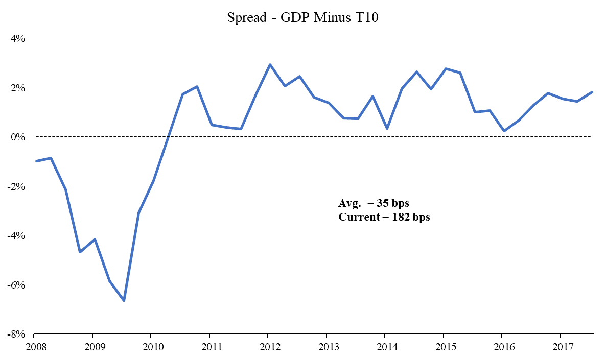
This raises the question – why is GDP consistently above the 10T?
Why hasn’t the 10T caught up to GDP?
I’m glad you asked.
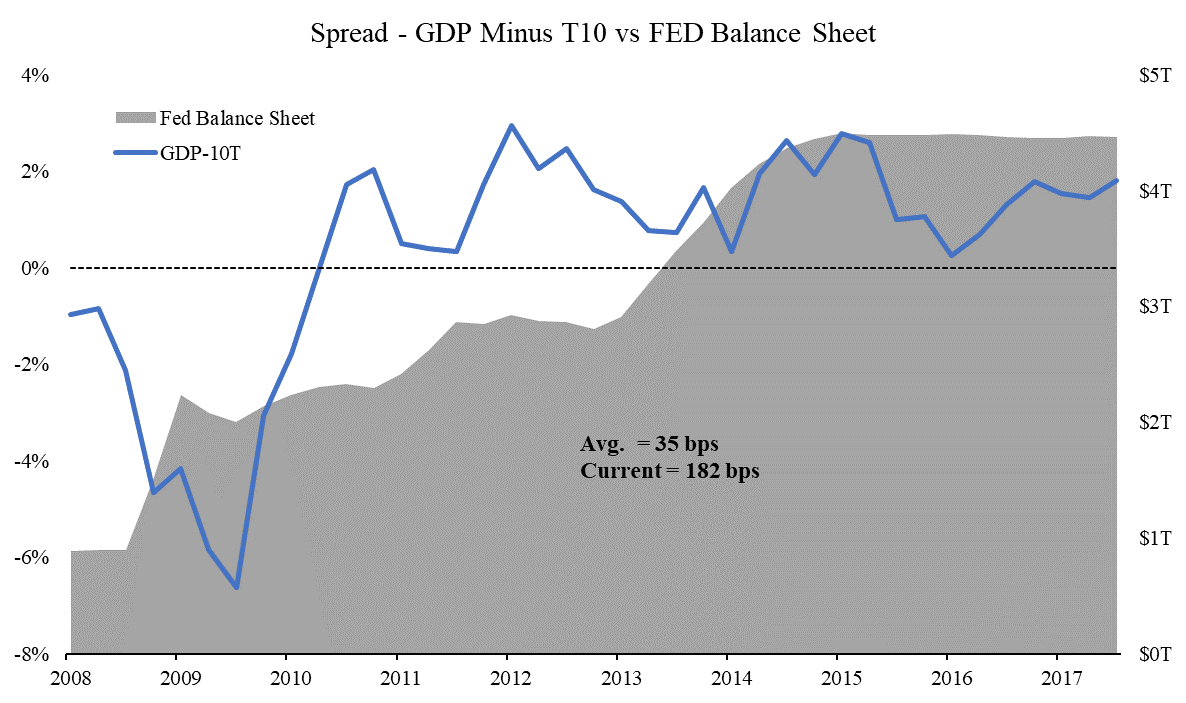
Here’s the same graph with the Fed’s balance sheet added. The Fed began QE in late 2008, but more intense QE2 wasn’t announced until November 2010. Notice in the graph how the spread relationship between GDP and Treasurys started breaking down as the Fed was buying up Treasurys each month.
Perhaps the 10T hasn’t caught up to GDP because of the massive Fed accommodation?
While GDP climbed, the 10T lagged as it was held artificially low by Fed bond buying programs.
If you assume GDP will stay at current levels, and
If you believe in the relationship between nominal GDP and 10T, and
If you think the Fed’s massive bond buying manipulated this relationship, and
If the Fed is now unwinding that massive bond buying…
Perhaps the relationship will start to correct?
As we saw above, the average spread over the last 10 years is 0.35%.
Today the spread is 1.82%.
Regression to the mean suggests the T10 could have 1.47% of upward movement.
That would put the T10 at 4.02%.
Average spread between nominal GDP and T10:
Since 1962 0.31%
10yr average 0.35%
30yr average -0.20%
Today 1.82%
Something has to give, right?
There is plenty of evidence to suggest that absent dramatic negative news (cough cough North Korea), there should be upward pressure on yields in 2018.
We aren’t calling for a 6% 10 year Treasury yield like Bill Gundlach, but a run up to 3.00% feels very reasonable.
Rates may initially climb gradually.
Then suddenly.
This Week
Markets closed Monday and a relatively light week ahead.
The Eagles are hosting an NFC Championship game – THIS IS NOT A DRILL!