

Last Week This Morning
- 10 Year Treasury at 4.05%
- German bund at 2.18%
- 2 Year Treasury at 4.39%
- SOFR at 5.32%
- Term SOFR at 5.34%
- Headline jobs data looked strong, but the underlying details paint a different picture
Job Market
I know you’re getting tired of me saying the labor market isn’t as strong as everyone says it is…but that doesn’t mean I’m wrong.
Friday’s report showed the economy added 216k jobs, far more than the forecasted gain of 175k. “This labor market is so resilient!”
OK, sure. But just like 12 out of the last 13 months, there were downward revisions to the previous months. October was revised down from 150k to 105k. Would we have been talking about a strong labor market in October if that had been the initial print? Why do we keep falling for this?
“Hey, check out this incredible report! We added 41k more jobs than forecasted!”
OK, but didn’t you revise down the last two months by a combined 71k?
But still, we added 216k jobs!
But weren’t a quarter of those government jobs?
The unemployment rate stayed unchanged at 3.7%!
OK, but isn’t that because 667,000 Americans dropped out of the labor force?
If the labor force participation rate had just held steady, the unemployment rate would have climbed to 4.1%? Why are we talking about a 3.7% unemployment rate just because people stopped being counted? That’s some shady math.
Oh, and if we use the same labor force participation rate from pre-covid, the unemployment rate is almost 5%.
Not weak, but not as strong as the headlines suggest.
Other Quick Takes from the December Jobs Report
- The number of persons employed part time for economic reasons, at 4.2mm, was up by 333k over the year.
- The number of persons not in the labor force who currently want a job was up by 514k over the year.
- Among those not in the labor force who wanted a job, the number of persons marginally attached to the labor force was up by 306k over the year.
Oh, before I forget – I didn’t actually write those bullet points. They are taken straight from the actual labor report itself. And I don’t mean I summarized them, I mean I copy and pasted like I am the President of Harvard. Unlike her, I’ll include my citation here.
If the report itself paints a picture like that, I’m confused why we keep spinning it as so positive?
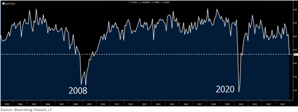
Also, the ISM Services Employment Index is in scary territory. This index tracks just services…you know the labor sector everyone keeps saying is red hot? On Friday, it fell off a cliff.
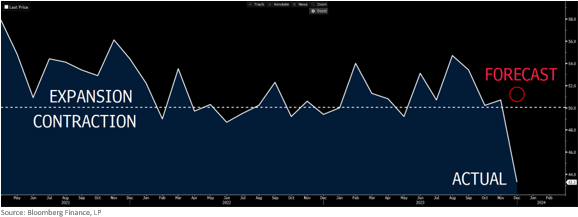
In fact, Friday showed the third lowest print on record, surpassed only by the Financial Crisis and Covid.
The labor market is not as strong as the headlines would lead us to believe. Yet month after month, we keep falling for it. At some point, isn’t it our fault for buying the headlines and overlooking the revisions?
What’s the Deal with These Revisions Anyway?
In 12 of the last 13 months, the initial NFP report has been revised down in the subsequent month. What’s the deal?
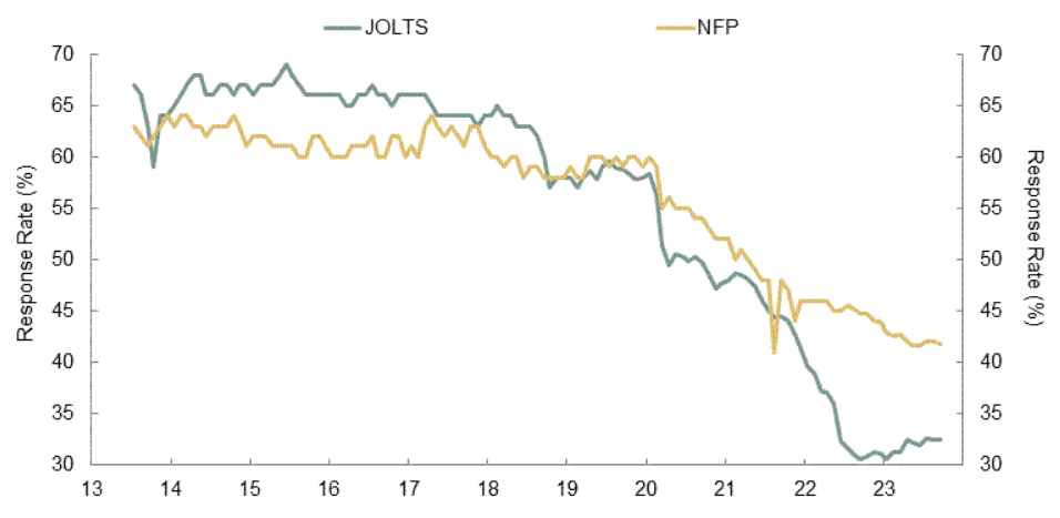
Response rates to these government surveys have plunged over the last five years. Up until 2018, the JOLTS survey I hate so much had a response rate of about 70%. Then it started falling and really plunged during the pandemic. It stands at 32% right now. SMBC put together a nice graph illustrating how response rates to both JOLTS and NFP have fallen over the last 10 years, with a notable drop over the last five years.
Put yourself in the shoes of a BLS statistician. You are required to keep putting out the same report, month after month, year after year, even as the quality of the surveys plunge. What do you do?
You make your best guess.
And then revise as more data comes in.
As then revise again as even more data comes in.
The BLS keeps missing the mark because it isn’t allowed to opt out of an NFP report each month despite the low response rate. But their guesses keep getting less accurate.
In 2017, their best guess was probably pretty solid. They had years of a 70% response rate to help fill in the blanks reasonably well.
But today? A 30% response rate, no stability over the last few years, and an unprecedented pandemic coupled with unprecedented stimulus. They are shooting in the dark.
Here’s my AI generated attempt to portray an increasingly frazzled Eagles fan BLS statistician.

Friday’s 216k is their best guess, but it’s not the real number. Over the next two months, actual data will help them fine tune that into a more accurate number, but by then we will be distracted by their newest bad guess.
The economic forecasts feel low each month, but they are far closer to reality. When we “beat” expectations, it’s only until the data confirms the initial print was overly optimistic.
It’s not their fault. They can’t opt out of an NFP report. It’s our fault for falling for it over and over and over again.
Fool me once, shame on you.
Fool me 13 times in a row, shame on me.
Rates and the Such
Speaking of bad guesses, I think the 10T will come back below 4% this week. I suspect there will be some jockeying ahead of CPI, and Fed speeches may move yields, but overall I think we are still headed lower.
Interestingly enough, Friday’s job report didn’t have a huge impact on market expectations for cuts this year. After the knee jerk overreaction to the headlines, odds of a March cut only fell by 8%, from 70% to 62%.
I still think June is the more likely first cut, but won’t be surprised by a cut in March. Powell’s dovish pivot at the December FOMC tells me he is seeing things that concerns him.
The Week Ahead
CPI is the data that matters this week. Core CPI is forecasted to fall from 4.0% to 3.8%, which would be the first sub-4% print since May 2021. The monthly number is forecasted for 0.3%, which annualizes at 3.6%. The 20 year average is 2.4% and there is work to do, but we’ve seen tremendous progress without a recession or a spike in unemployment.
Oh, and a football game, right?
First, can we all agree that UGA is the national champion? I will never understand why everyone was so comfortable excluding them from the playoffs. They were back to back champs, lost for the first time in over two years in the conference championship to a team that went to the playoffs, and have generally dominated college football for three years. Tiebreaker goes to the champ. But I digress…
Washington is the third best team in the country this year and I want to pick them. Even though Penix robbed PSU of a season opening victory in 2020, he throws dimes. Michigan has not played WRs like this. Michigan hasn’t had an opportunity to steal their signs all season long in preparation. Washington hasn’t been given enough love all season. I hate Michigan. For all of these reasons, I want to pick Washington.
But this seems to be Michigan’s year and they win in a close one. Harbaugh leaves for the Chargers or Bears. Michigan returns to irrelevance within two seasons. “Thank you for pointing out we aren’t the only ones stealing from other colleges,” – Michigan fans about my Harvard burn earlier.
And if you think I’m picking Michigan just to jinx them, you might be paying more attention than I give you credit for…sorry Randy/Peter/Austin/etc.