

Last month, Pensford hosted its first ever quarterly interest rate webinar. If you missed it, don’t worry, watch the recorded version at your convenience here.
Looking for an abridged version? We’ve got you covered. Below, we’ve compiled the 10 most popular graphs that were covered on the webinar.
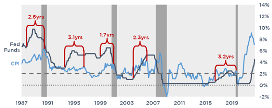
Lagging Impact of Rate Hikes on Inflation
There tends to be a delay in the impact of tightening Fed policy on inflation. In recent cycles, it’s taken an average of 2.5 years following the first rate hike before CPI dropped meaningfully, with the shortest being 1.7 years and the longest being 3.2 years.
Lagging Impact of Rate Hikes on Inflation
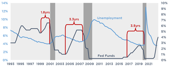
This also appears to be true for unemployment. On average, unemployment doesn’t start climbing until after the Fed starts cutting rates again. This contrasts the popular idea that the resiliency of the job market will dictate Fed policy
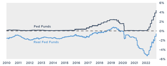
Real Rates
The real Fed Funds rate will be what dictates when the Fed stops hiking, not effective Fed Funds. The Fed measures the real Fed Funds rate as the effective Fed Funds rate less Core PCE, their preferred measure of inflation. Even with recent hikes, inflation adjusted Fed Funds remains negative.
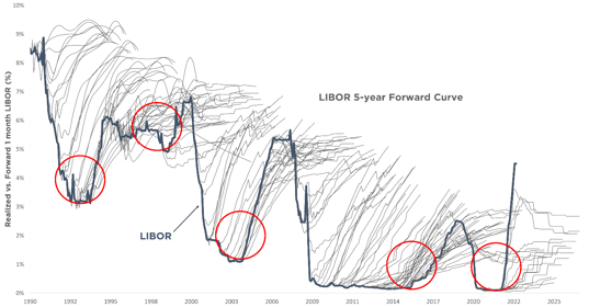
The Hairy Graph
Generally speaking, the market tends to overestimate the path of rates. The exception to this is during tightening cycles, where the market sometimes underestimates the path of rates in the near term. The so called “hairs” (grey lines) on the hairy graph represents various forward curves and the solid blue line is actual LIBOR.
Current Pace of Hikes
Compared to the previous five cycles, the Fed has quickly exceeded their typical pace of rate hikes.
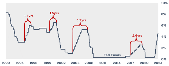
Time from First Hike to Pause
In the last four cycles, the time between the first hike and the first cut averaged 2.2 years and never exceeded 3.2 years.
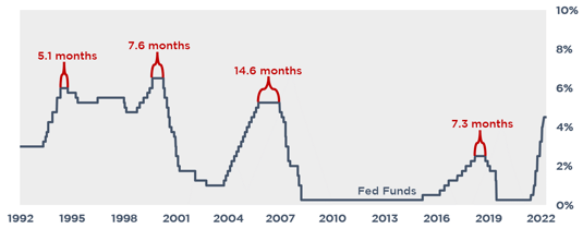
Time from Last Hike to Pause
Looking at those same cycles, the time between the last hike and first cut averaged 8.7 months and never exceeded 14.6 months. If the Fed stops hiking in Q1 this year, that could imply a rate cut by year end.
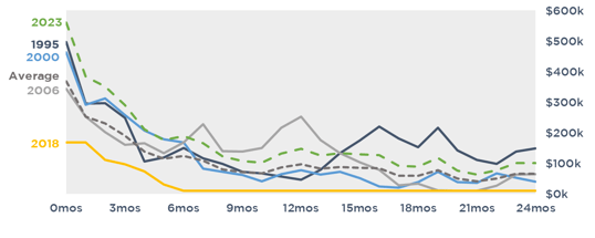
Cap Costs Following the Last Hike
Historically, cap costs tend to fall substantially once the Fed stops hiking. On average during the past four cycles, cap costs fell by 50% in 3 months after the last hike, and by 75% in 8 months.
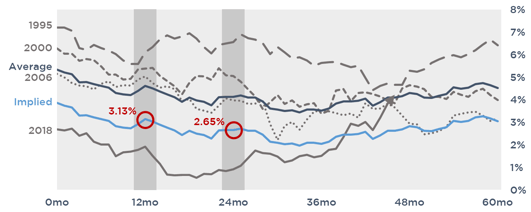
10T After the Last Hike
The long end of the curve also tends to fall following the last hike. Except for 1995, the 10T trended lower for the first 2 years following the last hike, averaging a decrease of 120bps. In today’s cycle, this could imply the 10T falls to 3.13% in 12 months and 2.65% in 24 months.
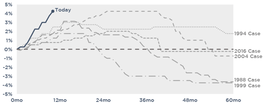
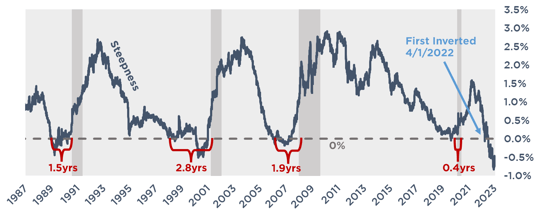
Yield Curve Inversion
A popular indicator, a recession tends to follow an inversion of the spread between the 2 and 10 year treasury. In the last four cases, the time between inversion and recession averaged 1.7 years and never exceeded 2.8 years. By this metric, this cycle has closely resembled the 1988 case, where the recession followed in just 1.5 years of the first inversion.
Q1 2023 Webinar
With the new year already underway, the next webinar is just around the corner. Stay tuned for the official announcement of the Q1 2023 Pensford Interest Rate Webinar, coming soon!