

Turns out the flu and spring break are not conducive to writing newsletters, so now that we are back in action today’s is a tad longer than usual. We examine Friday’s job report and will dig a little deeper into a concept we initially covered last month, the Fed Funds Shadow Rate. We will even draw a comparison between Donald Trump and the Fed. Things could get interesting.
I love the idea of a contested convention. It’s the culmination of a year’s worth of campaigning and debates where the collective voice of the electorate is heard…and then the party elite do a little sanity check just to make sure that voice didn’t screw up. True democracy in action.
The economy added 215k jobs last month vs a forecasted 205k. The unemployment rate ticked back up to 5.0%, but this was driven by an increase in the labor force participation rate (the highest in two years). Had the participation rate held steady, the UR would have dropped to 4.8%.
Average hourly earnings surprised to the upside, showing growth of 0.28%. The y/y change held steady at 2.3%. Both of these suggest some wage pressure which could translate into inflation. The problem is that 40% of the jobs added last month were in leisure/hospitality and retail – the two sectors with the lowest weekly earnings.
And here’s the real rub – headline inflation is picking up and is projected to climb throughout 2016. If wage growth fails to keep pace, real income will drop. This should translate into slower consumer spending, which in turn drags down GDP. Higher oil prices, which should help stabilize the overall economy, will only exacerbate this effect as a de facto tax hike on the lowest wage earners.
All of this is more likely a 2H 2016 issue as it takes time to develop, but the economy may factor more heavily into the election than politicians are currently expecting.
Dot Plot – Forecast or Worst Case Scenario?
Fed speakers have been notably hawkish since the FOMC meeting two weeks ago. This isn’t entirely a surprise, as Fed-speak is utilized to counter formal policy statements. The Fed doesn’t want to backpedal so soon after the first hike, so it keeps talking up a hike as a possibility.
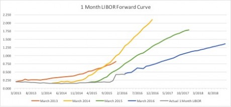
Take a look at the following two graphs. The first shows the Fed’s own forecasted path of Fed Funds over the last few years vs what has actually happened. Time and time again, the Fed overestimates the path of FF. In fact, the trend seems to be “FF will be flat for the next year and then will start climbing…” And yet it never actually starts climbing. Perhaps this is what the Fed wants? Expectations of hikes have nearly the same effect on financial conditions as actual hikes.
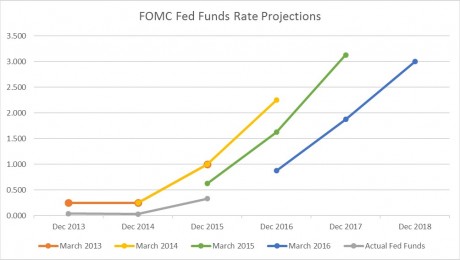
The market, taking guidance from the Fed, follows the same trend. Rates will be flat over the next twelve months, but surely they will climb in a nice linear fashion after that…
Perhaps the Fed’s Dot Plot (aka blue dots) should not be considered the most likely path of Fed Funds, but rather the ceiling. Perhaps two hikes this year isn’t the base case. It’s the worst case.
Said another way – how likely is the Fed to hike more than two times this year after it just revised its own forecast lower?
Seems about as likely as a #10 seed upsetting a #1 seed in the Final Four.
Fed Speak – Separating the Signal from the Noise
Complicating matters is the fact that Fed-speak is starting to display an alarming number of similarities with Donald Trump’s stand on abortion. Or his wall. Or nuclear proliferation. Or Israel. Or Afghanistan. Or Iraq. Or torture. Or immigration. Or Muslims. Or gun control. Or women.
Actually, he’s been pretty consistently misogynistic on that last one so that isn’t a good example. Like Trump, here are some confusing signals sent by Fed members over the course of last week.
Tuesday
- Yellen said it was appropriate to proceed cautiously on rate hikes. Global risks remain, notably oil and China. Worried that recent firmer inflation readings may reverse. Domestic data mixed, household strength offsetting commodity/USD drags.
- San Francisco Fed President Williams said there is some upside risk to inflation readings and economy could likely handle two or more hikes. Global disinflation holding domestic readings down.
- Dallas Fed President Kaplan (moderate non-voting member) said April is not off the table. Since he doesn’t vote on policy decisions until 2017, his view is discounted. Said consumer spending will keep the US out of recession.
Wednesday
- Chicago Fed President Evans (dove) said the risks are “tilted” to the downside and a very shallow pace of hikes is warranted. It is too early to tell if recent firmer inflation readings will continue and worries inflation expectations could drift lower. Expects two hikes this year.
Thursday
- Atlanta Fed President Lockhart (moderate), “I do not expect four hikes but see the potential for three.” Also suggested limited downside for being patient.
Friday
- Cleveland Fed President Mester (hawk) indicates she expects gradual rate hikes although she has slightly downgraded rate hike path since December. Sees 2.25%-2.50% GDP this year. Sounds like she thinks three hikes is a possibility.
Yellen is the signal.
Everyone else is the noise.
One economist suggested that inflation would need to run 3% for three years before it catches up to typical Phillips curve relationship (Yellen is a big believer in the Phillip’s curve). This suggests the Fed will need to let the economy run hot before hiking, something we’ve heard the Fed reference in the past.
The Fed’s own Summary of Economic Projections released at the March meeting showed Core PCE (the Fed’s preferred measure of inflation) not hitting the targeted 2.0% until 2018. How aggressively are they going to hike with such a flat trajectory for inflation?
In December we indicated that surprise inflation was our biggest worry when it came to interest rates. A low probability event, but one that could shift market sentiment quickly. Then oil collapsed and the concern was rightly swept under the rug.
Perhaps the biggest threat to the dovish tightening cycle instead is the fact that Yellen’s term expires February 2018. While the Supreme Court nomination is getting all the headlines right now, the next president will also appoint (re-appoint?) the next Fed Chair. It’s nearly impossible to envision the next chair being more dovish than Yellen, so the risk is to the hawkish side. In two years.
Yellen is the signal.
When she stops being dovish, so will we.
Shadow Rate
We touched on this last month and the feedback was so overwhelming we decided to dig a bit deeper. As you may recall, several economists attempted to create models that accurately accounted for unconventional accommodations by the Fed, but the most widely accepted is the Wu-Xia Shadow Federal Funds Rate. Created by U of Chicago professor Cynthia Wu and U of California professor Fan Dora Xia, the model has gained enough credibility that the Atlanta Fed now publishes it on their website.
The shadow rate is essentially the “effective” Federal Funds rate when central bank accommodations are taken into account. It provides an estimate of what the Federal Funds rate would be, given asset purchases (QE) and forward guidance, if the rate could be negative.
More precisely, the Shadow Rate represents the equivalent Fed Funds rate that would generate the observed yield curve if the zero lower bound (“ZLB”) were not binding.
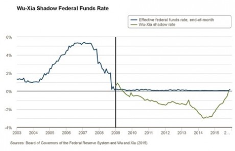
Though FFs remained near 0.00% from Dec 2008 until Dec 2015, the Shadow Rate dropped to a low of -2.99% in May 2014 as a result of QE. After QE was officially wound down in October 2014, the Fed began to change its forward guidance to suggest a long-term campaign to lift interest rates would begin in 2015.
The absence of QE and the change in forward guidance resulted in the Shadow Rate increasing 225bps in just over a year. The relatively robust tightening in 2015 was felt by equity markets, though Fed Funds remained at the ZLB essentially the entire year. The S&P 500 was relatively flat for 2015, while it had been up double-digits five of the six prior years. Once the ‘free money’ spigot shut off, economic growth slowed in kind.
The following chart illustrates the effects of quantitative easing on the Shadow Rate.
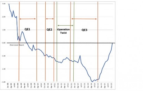
The single biggest take away is despite the traditional measure of tightening (an increase in the FFs rate) not occurring until December 2015, significant tightening had been taking place for more than 18 months.
During the last three tightening cycles the Fed conducted (1986-89, 1994-00, 2004-06), rates increased an average of 388bps. The Shadow Rate increased from its May 2014 low of -2.99% to 0% in November 2015, indicating a 300bp tightening in about 20 months before the December 2015 rate hike.
That implies 77% of the size of the average rate increases of the last three tightening cycle had already occurred prior to the December’s official ‘liftoff’.
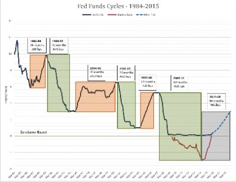
One point of interest (or possible concern?) is the sheer size and length of the recent easing cycle. If we account for the Shadow Rate, the effective Fed Funds rate dropped about 825bps over 80 months. For perspective, the prior two easing cycles averaged 612bps over 34.5 months.
Intuitively, central banks want their economies on solid footing prior to entering a tightening cycle. The US real GDP heading into the last three tightening cycles (1986-89, 1994-00, and 2004-06) was 3.20%, 2.65%, and 4.30% respectively. Current real GDP is not nearly as strong, hovering around 2.00%.
Based on the dot plots from March’s FOMC meeting, the median forecast for FFs is 3.00% by the end of 2018. This would equate to a total effective tightening of 600bps, significantly larger than the 388bp average increase in rates seen during the prior three tightening cycles.
The tightening cycle actually ramped up when QE ended in October 2014 and monetary policy has tightened over 300bps in the 18 months that followed.
Is this is beginning of the tightening cycle? Or the peak?
This Week
Quiet week ahead on the data front, but Wednesday brings the FOMC minutes from March 16th meeting. It is a relatively quiet week for US data but FOMC minutes on Wednesday will be closely watched.
We expect a general consensus on a pause with a smattering of hawkish rhetoric. There was probably some disagreement on the weight that should be given to global factors, with hawks trying to brush it aside and doves using it as justification for patience.
There isn’t much room for the minutes to surprise to the dovish side following Yellen’s speech, so the short term risk is for front end rates to move higher.
I am intentionally writing this ahead of Saturday’s Heels game. I go into every March Madness with two goals. The first and most important is a Duke loss. The second is a Heels championship.
I am halfway home to my goal and couldn’t stomach the thought of trying to write this on Sunday if the Heels lost to a team that almost didn’t make the tourney. I am a Philly fan to the core and accustomed to disappointment, though, so I temper my optimism.
But I think the Heels play tonight for the title.