

I’m about to upset a lot of people this week and I apologize in advance. I actually deleted a lot of this from last week’s newsletter after I got eviscerated by friends and family. Eviscerated. Shamed. I can’t recall another time in the 11 years of writing this newsletter that I self-edited so heavily. These are people I love, respect, and trust more than anyone else. They made clear I was on the wrong side and needed to keep my ignorant opinions to myself. So I quarantined my opinion. Which lasted all of one week.
With the market plunge over the last week, I wonder if the larger societal quarantine will last any longer than my opinion quarantine?
Coronavirus is exceptionally dangerous and highly contagious. We were ill-equipped to handle a pandemic. I personally was ignorant to the risks and to our own inability to counteract them. None of what I am about to say is rooted in a belief that this virus isn’t terribly serious. With those caveats out of the way….
![]()
The Rate Guy Podcast
Listen to this topic discussed on The Rate Guy podcast
Big Point #1 – Flattening the Curve is Overrated
Get the pitchforks out, light the torches, and come and get me…
Flatten the curve is such an easy concept, it has caught on quicker than the virus itself. The rabid adherence to it means you are either 100% in support of it or you are ignorant and reckless and are henceforth ostracized from society. I can’t recall another example of societal peer pressure like this since I was in 7th grade and for some inexplicable reason tucking your pants into your socks was the in thing. My company is working remotely right now as a result of societal peer pressure, not my actual belief that working from home will save their lives. Can I afford to be the only one that didn’t shut down and it turns out I was wrong?
But here’s the thing – social distancing provides the illusion of control, not actual control, over this virus.
There is no vaccine. Flattening the curve simply kicks the can down the road. It’s not like we go on lockdown for a few weeks while doctors go door to door inoculating us.
And that’s coming from someone that is actively practicing it. Our house is on lock down. We’re working from home. We only leave to grab essentials and come back. I stay six feet away from people. My parents cancelled a visit as they drove home to PA from Florida.
Here is the question that no one has answered to my satisfaction – can you describe to me what the successful lifting of quarantine looks like?
Without a vaccine, the minute we try to resume normal living, the virus starts to spread all over again. It takes one contagious person to emerge from quarantine to reset all those efforts. Those of us that have not been exposed during this shut down haven’t miraculously developed an immunity to it. We just delayed getting exposed. Whether I am exposed now or in two weeks or in two months, the odds are good that I will be exposed at some point. And that doesn’t even contemplate mutations of the virus, which starts the process all over again.
We are committing to be on quarantine between now and when a vaccine is developed, not just the next two weeks. I’m not sure that has sunk in yet for those that believe isolation is the cure-all here. My mom was sure I wasn’t following the logic.
“No, you’re not getting it,” my mom said. “It’s not about curing the disease. It’s about not overwhelming the health care system.”
No, I am pretty sure I get it. If a million Americans are going to be infected, let’s spread that out over time to ensure the hospitals can handle them all. I get it…promise…I understand it buys us time…but…
Big Point #2 – At What Cost?
If we are truly only on lockdown for the next two weeks, it’s probably a cost we are all willing to bear. But I have some bad news for you – it won’t be two weeks. Not with the current psychology of this disease. We are starting with just two weeks because it makes it easier to accept. It’s comfortable. They’re keeping us calm. Easing us into it. The next announcement is coming. Two weeks will become four weeks. A month will become three months. This could drag on the rest of the year.
The minute we lift quarantine measures, the second wave begins. Eventually the third wave. Or a fourth.
China is just now trying to emerge from a lockdown of more than two months. That puts our exit around June 1. I don’t think we can enforce a full lockdown as successfully as China can. And that assumes no setbacks. What if China has a second wave while we are in the middle of our quarantine? Are we really going to lift ours in the midst of their next wave?
This leads to an exceptionally uncomfortable cost/benefit analysis. How much economic value are we willing to lose to save a human life?
If the mortality rate was 50% and 165mm Americans would die from this virus, I suspect we would be willing to live under strict quarantine for quite some time. We’d be willing to endure a total economic collapse because we don’t like the prospect of losing half our family.
If the mortality rate is 1%, that’s 3.3mm Americans. That’s different.
And that assumes 100% of us get it. Which we won’t. Even without a quarantine. Because that’s not how viruses work. There is no precedent for an influenza virus spreading to 100% of the population. Ever.
Yeah, I’m willing to endure some economic hardship to avoid losing 3mm Americans. But how much? And how does my calculus change over time? That’s really uncomfortable to think about.
Everyone was all about doing their part to flatten the curve when it meant working from home and doing teleconferencing.
But now that they might lose their job? Tunes will change. Quickly.
If 2.5 million Americans lost their job last week like Goldman Sachs is forecasting, does that change our approach to flattening the curve? If the economy contracts by 25% in Q2, are we still willing to live under quarantine indefinitely?
Instead of 3mm Americans dying, what if it’s really more like 1mm? Or less? Heart disease kills 650k Americans each year – what if coronavirus kills that many instead? Would we accept a Great Depression in order to save them? If so, why haven’t we done so before now?
Big Point #3 – We May Need to Stop Listening to the Doctors
They’re so used to giving orders, and we’re so used to following their orders, that it feels weird to say that aloud.
But what if instead we think of them like lawyers? We take their advice and input. We consider their suggestions. We factor the risk.
And then we make our own decisions.
It’s easy for me to sit here and write that, less easy for the politicians in a fight to show who cares the most. Their race to out-caution each other or simply succumb to the same societal peer pressure we do is contributing to this mess.
I love Dr. Fauci. He’s a straight shooter. But his incentives are not necessarily aligned with ours. He is trying to save every single human life. But at some point we may need to balance that with the grim reality of our entire economy grinding to a halt. And I suspect he’s not going to struggle to pay his mortgage.
His job is to provide instructions on how to preserve our health, but he also has the luxury of not having to account for the economic fallout from his suggestions.
I think the decision to flatten the curve has been made in a medical vacuum without regards for the economic consequences.
Big Point #4 – What’s at Stake Economically?
The Great Depression had peak unemployment of 24.9% in 1933. Today, that would be 40mm unemployment Americans. If we extrapolate Goldman’s forecast of 2.5mm unemployed Americans last week, it would take just four months to hit 40mm unemployed. Doesn’t seem implausible that we are under quarantine for four months, does it?
In reality, that’s probably an unrealistic scenario. Layoffs are likely to spike initially, and then slow down and spread out…kind of like flattening the curve. Goldman may just be seeking headlines with an outrageous number. But still. The single worst month during the financial crisis was a loss of 800k jobs. Goldman is suggesting we lost 2.5mm in a week.
I’m not sure it’s totally unreasonable, either. You know those monthly job reports we talk about, the Non-Farm Payrolls? The service industry comprises 71% of the entire workforce. That’s over 100mm workers. Leisure and hospitality are 17mm. You know how many restaurant servers there are? Nearly 3mm. Same for teachers – 3mm. Now think about retail shops. Movies. Hair salons. Gyms. Festivals and conferences. Oil. Heck, the airline industry employs 750k people. The entire world stopped last week and all of those people are now at risk of losing their jobs or already have. I hope it was worth it.
To put things into perspective, during the financial crisis, the worst quarterly GDP print was -8.4%. In the Great Depression, it was -26.7%.
Some select forecasts from banks released late last week:
- Goldman -24%
- JPM -14%
- Deutsche Bank -13%
There is a growing consensus that Q2 could be the second worst economic quarter in the history of our country, only behind the worst quarter of the Great Depression. Meanwhile, total US deaths thus far are 350. This number will ultimately be much higher, but how high does it need to go before it justifies another Great Depression?
I think more people are nodding their head today than were a week ago. And more will be considering it in another week. I hope the dire economic forecasts are overblown. That will extend the timeline people are willing to live like this, which in turn does actually save more lives and increases the chances we discover a vaccine.
I believe flattening the curve helps, but that its benefit is overstated when we factor in economic costs.
You want to go all-in for the next two to four weeks? OK, I’m in. Get the tests built. Help out the hospitals. But after that, the natives will be getting restless. Maybe we un-quarantine in a scheduled manner? Workers start going back to work while elderly stay home and kids stay out of school. Restaurants and bars re-open, but with rules. Something.
If not, more Americans will start running the cost/benefit analysis. “I can’t pay my bills. I can’t pay for food. I will take my chances. Open the doors and let the chips fall as they may.”
Many of you reading this are months or maybe even years away from needing to think that way. But your tenants, and the employees of your tenants, are already facing that horrific decision. Unchecked, you may eventually face the same decision. Will your commitment to social distancing be as strong then as it is now? Will mine?
At some point, are we better off just resuming life and taking our chances?
Just as importantly, I think the approach we took last week was the wrong one because it can’t be enforced over the long term. South Korea and Singapore are having success using a scalpel approach.
Big Point #5 – The Stats Being Thrown Around Are Frequently Bullshit
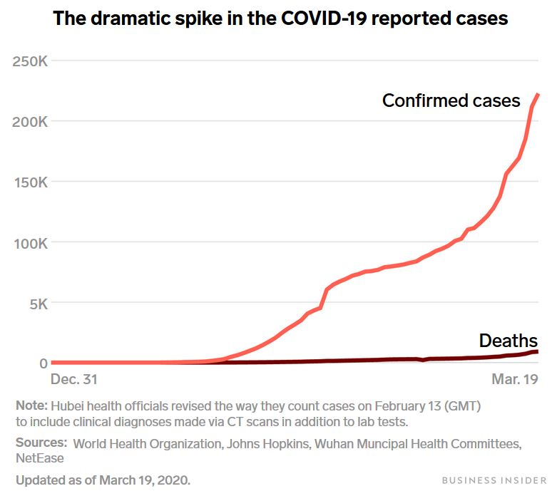
My mom is a retired math teacher. Even though she’s done teaching in the classroom, she can’t help herself sometimes. Knowing the kids were at home this week, she sent them this image from a CNN article on Thursday and asked if they could identify what was misleading about it.
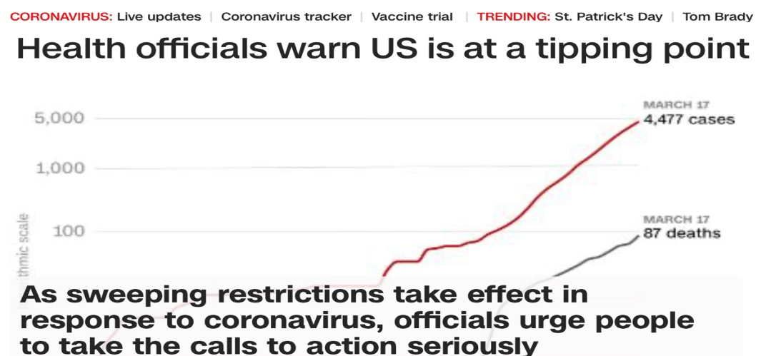
They couldn’t. Wanting to prove I was smarter than my own kids and establish dominance, I immediately pounced. “Look at the y-axis labels!” I had proven my intellectual superiority. I win. “You might not be in a classroom right now, but you just got taken to school!”
But that graphic planted a seed that would slowly grow and fester over the next few days. How much of the data can we trust right now? What if we are making severe decisions based on faulty information? The 2009 swine flu was eventually found to be no more serious than the usual flu. What if that ends up being the case today, but we set off another Great Depression in the interim? I’m sure {insert whichever party you hate the most} is to blame.
Here’s a common news story – let’s compare how countries are handling their responses differently and then judge them by the results.
“Our trajectory looks like Italy’s,” – Talking Head with fancy hair. Insert cool graph here supporting argument. We’re all going to die, but stay tuned for more breaking news after this commercial break.
Sure, but one quick question – do the United State and Italy have the same population? No. Italy’s population is 60mm, ours is 330mm. So why are we overlaying data on graphs without normalizing?
As I write this, I am staring at a graph from an article entitled, “Why we’re not overreacting to coronavirus, in one chart.” (https://www.vox.com/future-perfect/2020/3/20/21179040/coronavirus-us-italy-not-overreacting).
Online, this graph takes THREE SCROLLS to get from top to bottom of just the graph. Look how much I had to zoom out to see the whole graph on one page. This is one scary graph, definitely confirming we are not overreacting.
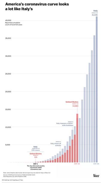
Once I dig in, I see that the top of the graph shows Italy is up to 40,000 cases. That’s a lot. But it’s not a million. Or 10 million.
The country that everyone is holding up as the idiots of the free world, the slowest to act, etc has seen 0.67% of its population get coronavirus, but we throw it on a graph like it’s the end of days. The number of cases in the US is about 1/10th of Italy’s, or 0.08% of the population. Are we so sure that we’re doing a terrible job? Put simply, if our graph looks like Italy’s graph, aren’t we actually doing better than they are?
“Yeah, but they have over 4,000 deaths! They have more deaths than China! And the United States is on the same path!”
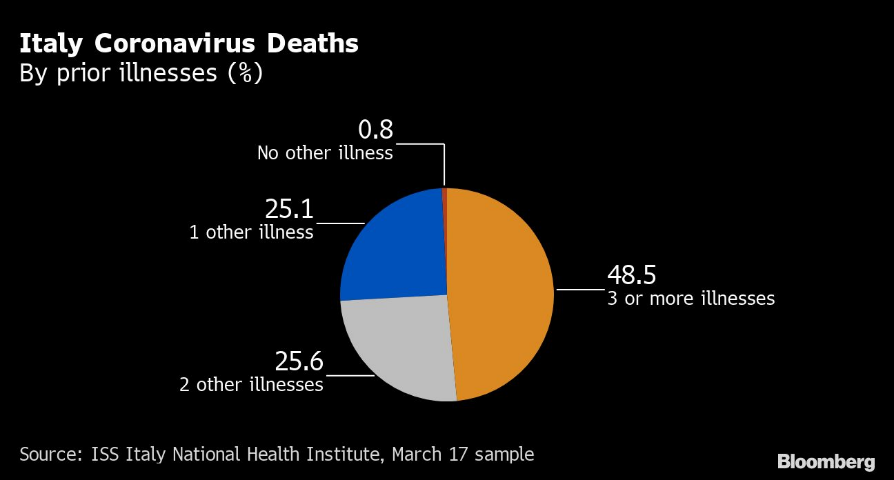
True, but 99.2% of Italy’s deaths had a serious underlying condition, with a median age of 80 years at death.
“Ok, but JP – why are you even reading Vox? Are they trustworthy? Let me show you this graph I found online…”
I stumbled across that Vox graphic because it was the first article that came up when I typed, “Johns Hopkins Coronavirus Map.” I have no idea what Vox is, but that means other people are seeing it when they Google the same thing. It’s probably a pay per click ad and it’s driving social reaction.
I was sent the now (in)famous map last Monday morning by a long-time client (thanks Ken). I thought it was great. At first. But the longer the week dragged on, the more I felt like it was a CNN twitter feed during an impromptu Trump speech about Hillary’s emails. It’s sensationalizing the results.
This makes it look like the world is being overrun by the virus.
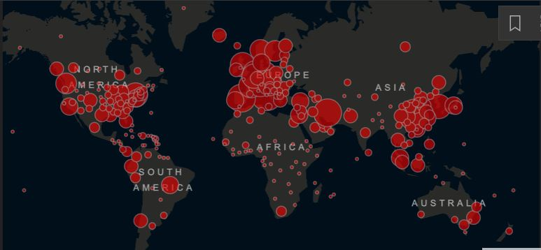
As of this writing, there are over 300,000 cases. It’s not a small number. But the total world population is 7.5 billion. That means .004% of the world’s population has coronavirus. Is that the takeaway you would get from that graphic?
Furthermore, it’s showing cumulative cases. What good is that when nearly everyone recovers from it? If there are 300,000 cases and 13,000 deaths, that means a majority of the 287,000 pending cases will lead to recovered patients.
For those of you too young to remember, AIDS was the scariest disease out there when I was growing up. It was scary because you couldn’t recover. If you got AIDS, you died from AIDs. An illustration using cumulative cases would make more sense in that scenario. But not here, when the vast majority of patients will recover. Stop telling me how many total cases there are.
Other Influenza Pandemics – Stats
Well I had to fall down a rabbit hole to ensure I wasn’t totally off base.
The Reproduction Rate (R0 pronounced “R naught”) is a measure of contagiousness, which I think of as the transmission rate. A typical flu will have an R0 of about 1.3, meaning each person that has it infects 1.3 other people. Obviously, the higher the number, the more contagious it is.
Mortality rate is the % of cases the end in death. The higher the number, the more deadly it is. The typical flu is less than 0.1%. Remember that when you hear this one is 10x deadlier. It is, but that makes it 1.00%, not 50%.
Right now, it appears as though COVID-19 has an unusually high R0, making it more contagious than the average influenza virus. We won’t know for a long time, but best guesses right now put it at 2-2.5. That’s higher than usual and part of the reason people are jumping all over me.
“JP, you don’t get it, it’s spreading exponentially. In Italy, 40,000 today is 80,000 in a couple of days and pretty soon all 60mm Italians will have it. Italy’s mortality rate is 12%, so that means over 7,000,000 Italians will die. It’s just math, why don’t you get this!?”
Ummmm, yes, the math is right. But again, that’s not how influenza viruses work. No influenza virus in history has ever kept spreading exponentially until it reached 100% of the population, even without quarantine. This isn’t a f*cking movie. The Spanish Flu of 1918 hit 50% of the world in the midst of World War I when every soldier and citizen was malnourished, sick from something else, and laying on top of each other. The average influenza pandemic ends up infecting about 15% of the population, not 100%.
Besides, the mortality rate is really what matters. The WHO’s own guidance says this coronavirus has a mortality rate today of 3.4%, but that’s based on testing done on those with the most severe symptoms thus far. There’s a self-selection bias that’s artificially inflating that rate.
Once you factor in those that have not been tested before now and those that have had it and recovered, the number will be much lower. The mortality rate will undoubtedly shrink dramatically over time as more confirmed cases came in without a resulting increase in deaths. This graph does a good of helping to visualize that concept.
There have been six influenza pandemics stretching back to the late 1800’s. With one notable exception, none of them have had a 1% mortality rate. In fact, none of them had a mortality rate greater than 0.3%, nowhere close to even 1.0%. That is substantially less than the current estimates of 1.4% – 3.4%.
The one exception?
The 1918 Spanish Flu
The 1918 Spanish Flu pandemic is widely considered the most devastating pandemic in modern history. It had a slightly above average transmission rate of 1.8, but a mortality rate of anywhere from 2%-10% (https://www.cdc.gov/flu/pandemic-resources/1918-pandemic-h1n1.html). That’s shockingly high.
Some of the current hysteria is the result of extrapolating those numbers across current populations. “40mm people worldwide might die!” – journalist that benefits from sensational headlines using 1918’s stats.
True. But also, we aren’t in the middle of World War I with 30% of US physicians overseas and nearly every able-bodied American male living on top of each other in trenches. So there’s that little difference.
The CDC also notes about the 1918 Spanish Flu, “The high mortality in healthy people, including those in the 20-40 year age group, was a unique feature of this pandemic.” It killed otherwise healthy people. We are not seeing that with COVID-19. In fact, kids under 9 appear to be nearly unaffected. It isn’t the healthy that are dying, it is the compromised.
The CDC also notes there were, “…no antibiotics to treat secondary bacterial infections.”
There were no antibiotics to treat secondary infections like there are today. In a war zone. It wasn’t only the initial virus that killed them, it was the lack of antibiotics to treat subsequent bacterial infections, no doubt exacerbated by war time conditions. This is a big reason why subsequent pandemics haven’t had nearly the same mortality rate. And before you go all flatten the curve on me, it doesn’t require a hospital visit to get an antibiotic prescription.
Swine Flu
This was the most recent pandemic and began in 2009. It had an R0 of 1.46 and a mortality rate of .03%. It killed about 500k people worldwide, of which 12,000 were in America.
Most importantly, the CDC eventually concluded that it was no worse than the regular flu.
https://www.webmd.com/cold-and-flu/news/20100907/h1n1-swine-flu-no-worse-than-seasonal-flu
If you’re worried about an overreaction, this is the sort of thing to scream into your echo chamber today.
Regular Old Flu
The CDC estimates that approximately 8% of Americans get the flu each year (https://academic.oup.com/cid/article/66/10/1511/4682599). That’s about half the normal pandemic rate and translates into 26mm Americans each year on average. An average of 36,000 Americans die each year from the common flu.
The 2017-2018 flu season was especially bad, with 45mm flu cases that resulted in over 800,000 hospitalizations and 61,000 deaths.
Think about that for a second. We average 36,000 deaths per year from the flu, about 35,600 more than we’ve had from coronavirus thus far. We have 60,600 fewer deaths from coronavirus than we did from the flu just two years ago. Yet the country has seized up.
Yes yes, I know it’s going up quickly. But what if it doesn’t go up as much or as quickly we currently fear? Will we regret the decisions we are making today?
Stats are invaluable, but let’s make sure they aren’t being used simply to stoke fears. Also, that CNN graph I used at the beginning was logarithmic, so while technically correct I still believe it was misleading…plus my mom had to tell me that when I told her the graph made the newsletter.
Big Point #6 – Random Thoughts
Some other off the cuff thoughts:
- What we really need more than anything is the ability to test everyone, repeatedly. The lack of precision in targeting affected individuals is why we took the blunt approach. Why we are testing anyone right now when we only have a few kits is mind boggling – it won’t change treatment. The treatment right now is hold on and hope.
- the longer we endure economic hardship, the more likely we will be to take the 1% odds of death
- the more severe the economic contraction, the more likely we will be to take the 1% odds of death
- what does enforcement look like if patience wears thin? Will the government use the military?
- will social peer pressure to quarantine/social distance subside the longer this drags on?
- will Americans start pressuring politicians to let them get back to living?
- will the government start massaging its message over the next month in order to placate us? Dangle some hope, show a light at the end of the tunnel, just to keep us from revolting?
- will crime increase, some of it out of basic necessity for survival? Do we arrest a single mother for stealing food for her starving children?
Big Point #7 – Takeaways
Let’s say we all stop caring about preventing the spread of COVID-19 today, throw open the doors, and decide to take our chances.
Let’s say instead of 15% of the population getting it, 30% do. Twice as bad as normal.
Let’s say instead of a 0.3% mortality rate, it’s 0.60%. Twice as bad as normal.
Total American deaths in that scenario? 594,000
Less than heart disease.
One is setting us on course for another Great Depression, while the other is a despicable but accepted part of life. Why is one being treated so differently than the other?
Given how long we will need to live under quarantine-like conditions to make them effective
and
until we have a near term timeline for a vaccine
and
given how sharp the economic contraction will be during that phase
and
given how little we actually know about COVID-19’s transmission and mortality rate
please
go ahead and put me down in the camp of taking my chances
My mom thinks I’m insensitive to the fact that people will die. But I think that’s going to happen anyway. The virus will do what it was made to do – spread. There will be deaths. Just like there are from heart disease. Or car accidents. Or the flu. It’s life. It might be my turn. Or a loved one.
But until I’m convinced the probability of those life and death consequences fall outside the normal realm of pandemic expected outcomes, I don’t see why we should push the economy into the next Great Depression out of fear alone.
Last Week This Morning
- 10 Year Treasury started the week at 0.72%, got as high as 1.22%, and finished at 0.84%
- German bund jumped higher by 20bps to -0.32%
- Japan 10yr climbed to 0.05%
- 2 Year Treasury got as high as 0.50% before finishing the week at 0.31%
- LIBOR dropped to 0.61%, then spent the week climbing to 0.93%
- SOFR started at 1.20%, fell to 0.10%, climbed to 0.54%, and closed at 0.06%
- The Ocho. ‘Nuff Said
- After about a week of everyone working from home, I know two things
- I hate the acronym WFH
- The office market is going to rebound sharply at some point, this is bs
- And to think I really liked Richard Burr
- TB12 to the Bucs? C’mon, I can only take one black swan event at a time.
I only have the energy for one more topic this week. Hopefully next week is better.
Why is LIBOR Climbing?
Because there’s a shortage of dollars.
In October 2008, one of the reasons Wachovia went under was a run on the bank. Everyone with deposits was moving them to another bank. It was crippling.
Just as importantly, anyone with a line drew down fully, which they also deposited another bank.
Learning their lessons from 2008, banks were prepared for last week’s. They were unwilling to lend cash, instead hoarding it for the expected wave. How do you get someone to lend you money if they don’t want to? Offer to pay them more interest. That’s why LIBOR climbed.
And the wave came – corporate borrowers drew about $60B last week. Ford alone drew down $15B on Friday.